You can’t add square footage to a studio, but you can change how many of them the eye actually registers. That’s the whole game. A 400 sq ft apartment where the floor is visible, the light reaches every corner, and nothing chops the room in half reads as noticeably larger than an identical 400 sq ft apartment stuffed with waist-high furniture and lit by a single ceiling bulb.
None of the tricks below involve knocking down walls or asking a landlord for permission. Most cost less than a weekend of your time, and a few cost nothing at all beyond rearranging what you already own. They’re the same moves interior designers reach for when a client’s budget won’t stretch to a bigger place — borrow light, raise the eye, keep sightlines open, and let the floor breathe.
Here’s what each one does and, where it helps, exactly what to buy to pull it off.
Table of Contents
1. Hang a Mirror Opposite the Window, Not on a Blank Wall
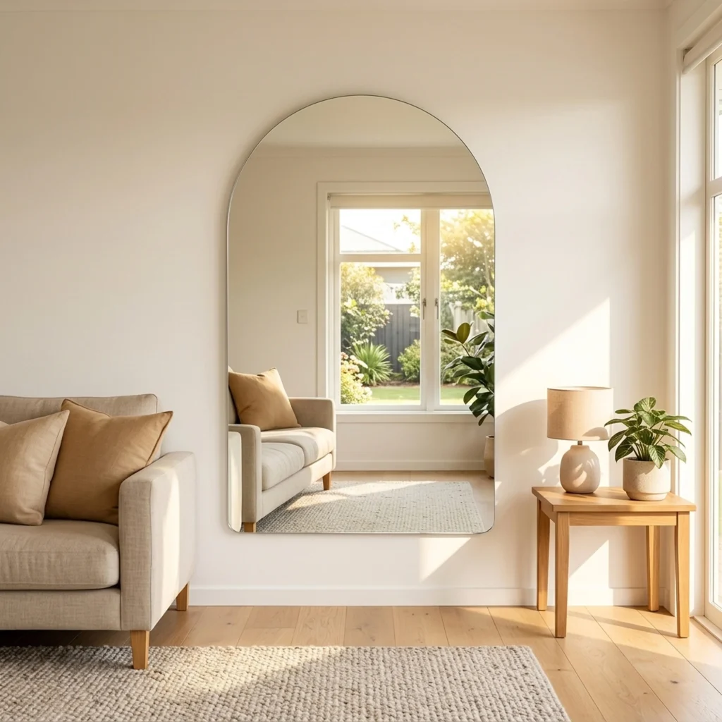
Most people hang a mirror wherever there’s an empty wall. The trick is to hang it directly across from your largest window so it catches the daylight and throws it back into the room. A studio with one window effectively gets a second light source this way, and the reflected view of the outdoors reads to the brain as another opening in the wall.
Go big. A single mirror at least three feet tall does more than a cluster of small ones, which just create visual clutter. Lean a full-length floor mirror against the wall if you can’t drill, or hang a large round or arched mirror centered on the window’s reflection. Skip anything with a heavy, ornate frame; a thin metal or frameless edge disappears and lets the reflection do the work.
2. Use One Large Rug Instead of Several Small Ones
A common instinct in a small room is to buy a small rug, on the logic that a big one will overwhelm the space. It does the opposite. A too-small rug floating in the center of the floor draws a tight box around itself and makes the room feel like a doll’s house. One large rug that runs nearly wall to wall, with just a few inches of floor showing around the edge, unifies the space and pushes the boundaries outward.
The rule of thumb: the front legs of every major piece of furniture should sit on the rug. In an open studio, that often means a single 8×10 anchoring the whole living zone.
3. Hang Curtains High and Wide
Where you mount the curtain rod matters more than the curtains themselves. Mounting the rod just above the window frame makes the ceiling feel lower and the window smaller. Mount it close to the ceiling instead, and extend it four to eight inches past each side of the window frame, and two things happen: the wall reads as taller, and the window looks significantly wider than it is because the fabric hangs over wall, not glass.
Choose panels that just kiss the floor, in a light, airy fabric and a color close to your wall. Heavy, dark, or short curtains that stop at the sill all shrink the room. Linen and cotton blends in off-white, oatmeal, or pale grey are the safe studio choice.
4. Choose Furniture With Legs
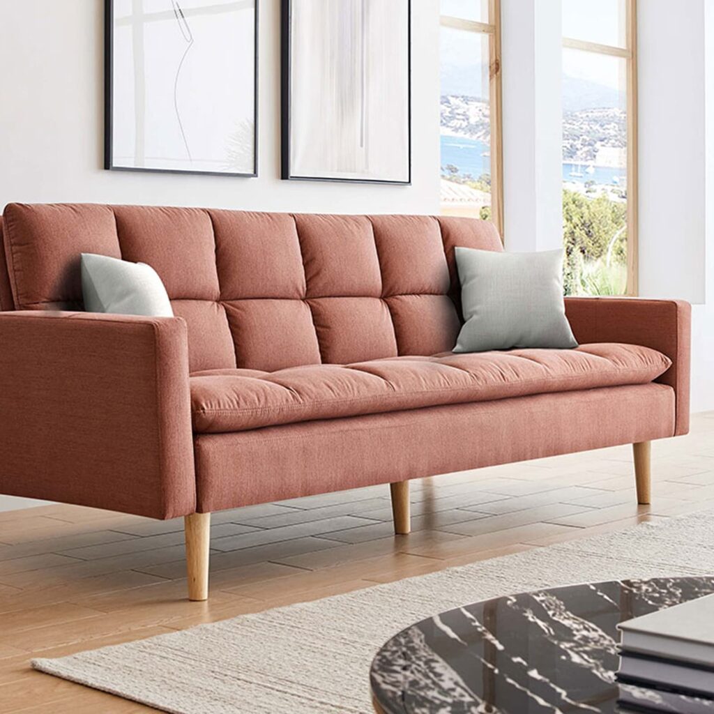
Furniture that sits directly on the floor reads as a solid block and stops the eye. Furniture raised on visible legs lets the floor run continuously underneath it, and that sliver of visible floor is what tells your brain the room is bigger than the furniture sitting in it. It’s why a mid-century sofa on tapered wooden legs feels lighter in a studio than a boxy sectional whose base meets the ground.
Apply this to the pieces with the biggest footprint first: the sofa, the bed frame, and any console or media unit. A platform bed with an open base under it, or a sofa you can see the floor beneath, both buy back visual space without buying back an inch of actual space.
5. Keep the Palette Tight and Low-Contrast
Every hard color break in a room is a stop sign for the eye, and a room full of stop signs feels chopped up and small. Keep walls, large furniture, and curtains within a few shades of one another and the eye glides across the whole space uninterrupted, which reads as more room. This is why designers lean on off-white, greige, warm grey, and soft taupe in small spaces: not because color is forbidden, but because contrast is what fragments a room.
You don’t have to live in beige. Bring color and personality in through small, movable things: a throw, a stack of books, a single piece of art. Keep the big surfaces quiet and let the accents carry the interest.
6. Draw the Eye Up With Vertical Storage
In a studio, the floor is the resource you’re always short on and the walls are the resource you’re wasting. Every item you can move off the floor and onto the wall gives you back both storage and open ground. Floating shelves that climb toward the ceiling pull the eye upward, which makes the ceiling feel higher and the whole room taller.
Run shelving in a vertical column rather than a wide horizontal band, and mount the top shelf higher than feels natural. A tall, narrow bookcase does the same job on a bigger scale.
7. Make Every Piece Do Two Jobs
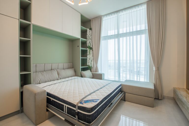
Count the furniture in a cramped studio and you’ll usually find one piece per function: a bed, a sofa, a coffee table, a desk, plus a spare mattress somewhere for guests. Furniture that collapses those functions into fewer footprints is how you claw the floor back. A storage ottoman is a coffee table, a footrest, extra seating, and a place to hide blankets. A sofa bed is a couch and a guest room. A Murphy bed hands you your entire floor back every morning.
Every function you can double up removes a piece of furniture from the floor, and empty floor is the single strongest signal of space.
8. Keep the Center Low and the Tall Stuff on the Walls
Line the tallest pieces you own along the perimeter walls and keep everything in the middle of the room low, and the sightline from one side of the studio to the other stays clear. A clear sightline reads as a bigger room. A tall bookcase or wardrobe floating in the center does the reverse: it slices the space into two smaller rooms and shrinks both.
Think of the middle of the studio as a valley you can see across. A low-back sofa, a coffee table, a small ottoman, all under about waist height, keep that valley open. Save the height for the edges, where it doesn’t block the view.
9. Light the Room at Three Levels
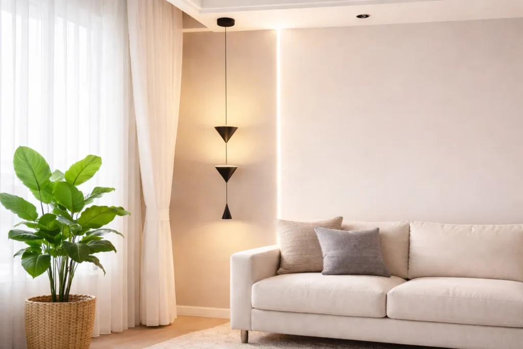
A single overhead fixture flattens a room and leaves the corners dark, and dark corners make a space feel like it stops where the light stops. Layering light at three heights fixes this: something overhead or high (a pendant or track), something at eye level (a wall sconce or a table lamp), and something low (a floor lamp in a corner). Light reaching every corner makes the eye register the full depth of the room.
This matters twice as much in a studio because you’re lighting several zones with one open space. A warm-toned bulb in the sleeping corner and a brighter one over the work area let the same room feel like two, without any physical divider.
10. Let Light Pass Through Your Furniture
Solid, opaque furniture blocks the view behind it and makes the room feel walled off. Furniture you can see through lets your eye travel straight past it: a glass or acrylic coffee table, an open-frame console, a metal-and-glass side table all read through to the wall or floor beyond, so the room feels continuous rather than boxed off.
You don’t need to furnish the whole studio in glass. Pick the one or two pieces that sit in the middle of a sightline, usually the coffee table and any accent table near the seating, and make those the see-through ones. The bulkier pieces against the wall can stay solid.
11. Divide Zones Without Blocking Light
A studio often needs to feel like more than one room, but a solid divider that reaches the ceiling just builds a smaller room inside your small room and cuts off the light. The better move is a divider that suggests a boundary without sealing it: an open shelving unit you can see through, a slim slatted screen, a curtain on a ceiling track that pulls back when you don’t need it.
The goal is to define the sleeping zone or the work zone while letting daylight and sightlines pass straight through.
12. Leave Surfaces Mostly Empty
This is the trick with no price tag and the biggest payoff. Every surface crowded with objects reads as clutter, and clutter reads as a smaller, busier room. Clear the coffee table down to one or two things. Keep the kitchen counter mostly bare. Style shelves with breathing room between objects instead of packing them.
Negative space is not wasted space in a studio; it’s the thing doing the heavy lifting. If you want a wall to feel intentional rather than empty, a single well-placed piece of art or one considered arrangement does more than a dozen scattered frames.
Quick Reference: What Each Trick Actually Does
| Trick | What it changes | Cost |
|---|---|---|
| Mirror opposite window | Borrows daylight, fakes a second opening | $ |
| One large rug | Pushes the floor boundary outward | $$ |
| Curtains hung high and wide | Raises the ceiling, widens the window | $ |
| Furniture on legs | Shows floor under furniture | Varies |
| Tight low-contrast palette | Removes visual stop signs | Free–$ |
| Vertical storage | Draws the eye up, frees the floor | $ |
| Multi-functional furniture | Cuts the number of pieces | $$$ |
| Low center, tall walls | Keeps sightlines clear | Free |
| Three-level lighting | Reaches dark corners | $$ |
| See-through furniture | Lets the eye pass through | $$ |
| Light-permeable dividers | Zones without shrinking | $$ |
| Empty surfaces | Removes clutter | Free |